SEARCH
Chrome logo is about to change after 8 years

SHARE IT
Changing a logo may not affect the experience of using a service or application at all, but any change is always interesting, as it can sometimes be a harbinger of more important developments in terms of functionality.
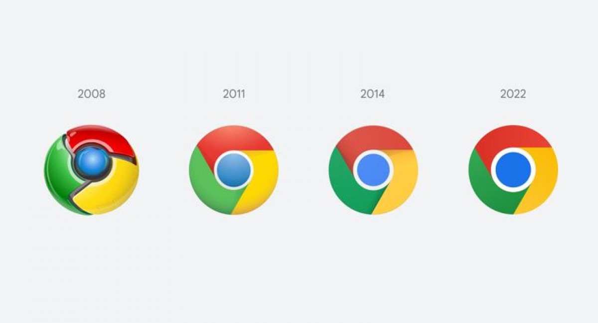
We do not know if Google has this in mind for products placed under the Chrome umbrella (browser and operating system), but we can note that the logo changes after 8 years.
The changes are not very big and if you do not see the previous logo side by side you will probably not understand any difference. However, Elvin Hu (one of the designers of Google Chrome) reports that the shadows have been removed, the colors have been better separated and the blue circle in the center is slightly more intense.
Moreover, Hu notes that the new Chrome logo will look slightly different depending on the user's operating system. In Chrome OS the colors are more intense, in macOS it will seem to hover above the dock of applications, while in Windows 10/11 the gradient effect will be more visible to match the design philosophy of Microsoft.
MORE NEWS FOR YOU

 Help & Support

