SEARCH
Google updates its "G" logo after 10 years

SHARE IT
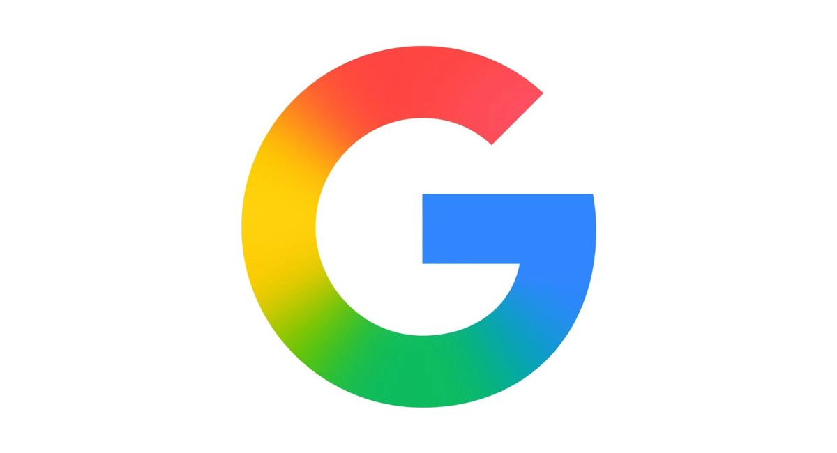
Nearly thirty years after its launch, Google is still refining the way it presents itself to the world. What started as a modest search engine in the late 1990s has grown into a sprawling technology empire, and with every stage of its evolution, the company’s logo has served as a visual marker of change. This month, as Google turns 27, the familiar “G” symbol is getting another facelift—this time with brighter, gradient colors that will appear across the company’s entire portfolio of products and services.
Back in 1998, Google was a simple, text-heavy website where users typed queries from bulky desktop computers. Few could have predicted that the once-minimalist search engine would expand into nearly every corner of digital life. Today, Google is present in smartphones, televisions, smart home devices, and even cars. Whether a person taps, types, or speaks, Google is ready to respond—and its logo is now designed to reflect that broad reach.
The company has stayed loyal to its signature palette of blue, red, yellow, and green since its earliest days. But how those colors are arranged has shifted repeatedly. A turning point came in 2013 with the introduction of a flat, simplified wordmark. Two years later, Google unveiled the multicolored “G” favicon, a compressed but instantly recognizable version of its full name. At the time, the company explained that the change reflected “all the ways people interacted with Google products across our platforms, apps, and devices.”
Fast forward a decade, and the latest refresh signals another stage in the company’s identity. Earlier this year, the “G” received a modern update: instead of solid tones, the design now features a vivid gradient of the four trademark colors. Initially rolled out for Google Search, the brighter emblem is now spreading across all Google services, from Gmail to Maps to Chrome.
It is no small shift. With a dominant 90 percent share of the global search engine market and around 70 percent for Chrome, Google’s visual identity is inseparable from its massive user base. Every tweak to its logo resonates with billions of people worldwide. But beyond web browsers and search bars, Google has been eager to show that its ambitions extend far further. The company has experimented with self-driving cars, high-altitude balloons delivering internet access, and countless other moonshot projects. Each new venture feeds into its larger narrative of innovation—a story the new design is meant to embody.
Brand identity has always been central to Google’s approach. Android, one of its flagship products, has long been associated with the color green. Recent updates gave its Bugdroid mascot a 3D makeover, adding personality and depth to the brand. YouTube, meanwhile, has stayed firmly tied to its iconic red. What ties all these strands together is the enduring presence of Google’s four-color system, now expressed in a brighter, more dynamic form.
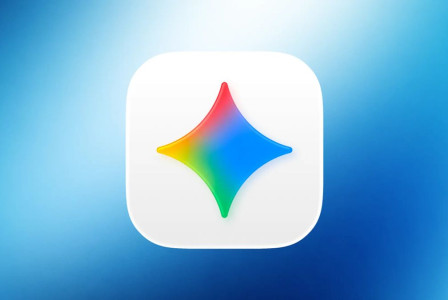
Artificial intelligence is the latest frontier shaping Google’s image. Over the past two years, the company has invested heavily in its Gemini-branded AI tools and services. The gradient color scheme now applied to the Google “G” first appeared in the Gemini logo earlier this year. According to the company, the refreshed design symbolizes not only continuity with its roots but also the “surge of AI-driven innovation and creative energy” that is defining its next chapter.
By adopting a unified visual style across products, Google is ensuring consistency in an ecosystem that touches nearly every aspect of modern life. From Android smartphones to AI-powered applications, users will encounter the same bright emblem—a signal of trust, familiarity, and, increasingly, technological ambition.
The move also highlights how design choices can serve as storytelling devices for corporations. A simple logo update becomes more than a cosmetic change: it’s a subtle way of telling users that Google is evolving without abandoning its past. As digital landscapes grow more complex and competitors multiply, even small design refinements can play an outsized role in shaping brand perception.
Google’s logo history reveals a company that is constantly in motion, never content with static imagery. The new gradient design is not a radical departure but a carefully calibrated adjustment—just enough to feel modern while keeping the brand instantly recognizable. For a company with billions of daily users, that balance between novelty and familiarity is essential.
As the refreshed “G” gradually replaces its predecessor across products and platforms, it will become the new face of a tech giant that continues to reinvent itself. Google’s birthday may be an occasion to look back on its journey from Stanford project to global powerhouse, but the logo update points forward—to a future defined by AI, interconnected devices, and an ever-expanding universe of digital services.
MORE NEWS FOR YOU

 Help & Support

